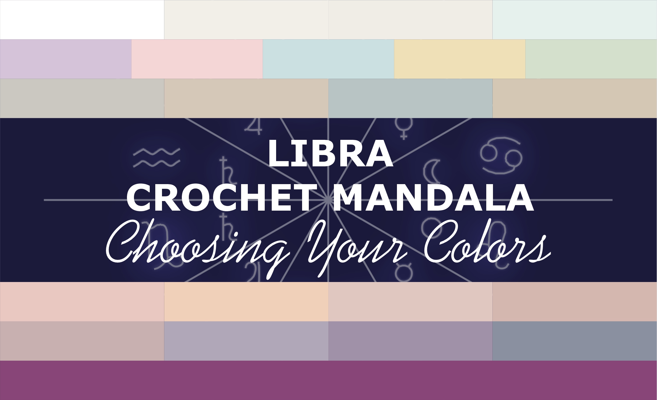
When we crochet the Libra mandala, colors help us feel harmony. Some are light and translucent, like morning air. Others are soft and refined, like flower petals. Others still are calm and steady, like the silence after a conversation.
This palette has both warmth and coolness, lightness and depth. It’s about the desire to be in balance and equilibrium across many different areas of life.
I’ve grouped them by meaning, but of course, you can choose according to your own taste — take more or fewer shades, swap them around, add your own. Harmony begins where we allow ourselves to choose.
Group 1. Air and Lightness

The lightest, most transparent, almost weightless shades. They don’t press — they create room to breathe.
Libra is an air sign. Everything starts with lightness. With a blank slate. With the possibility of starting fresh, without looking back. These colors help you straighten your shoulders and let the light in.
White — #FFFFFF
Translucent Pearl — #F2EFE9
Pale Flax — #F0ECE6
Mint Freshness — #E6F0EC
Group 2. Beauty and Elegance

Soft, pastel, refined colors. The ones that please the eye and set the mood.
Libra beauty is not about brightness — it’s about sophistication. About noticing a shade where others see only a solid background. About the aesthetics that live in the details. These colors remind us: the beautiful doesn’t always catch the eye — sometimes it’s quiet.
Soft Lilac — #D5C4D9
Rose Petal — #F5D6D6
Watercolor Blue — #CBE0E0
Soft Yellow — #F0E0B8
Pale Pistachio — #D4E0CC
Group 3. Balance and Foundation

Restrained, neutral, balanced shades. They don’t steal the spotlight — they create the foundation.
Libra harmony rests on balance. Not too bright, not too dull. Not too cool, not too warm. These colors are like strings in an orchestra: each on its own, but together they create a sound. They help you find that sweet spot where everything is in its place.
Pearl Gray — #CAC8C0
Warm Beige — #D5C8B8
Gray-Blue — #B8C4C4
Sand — #D4C8B4
Group 4. Relationships and Connection

Soft, warm, “human” colors. About contact with others, about support, about how we respond to each other.
Libra is the sign of relationships. We don’t exist in a vacuum — we’re always next to someone. These colors are about the ability to be present, to hear, to feel. About the warmth that arises between people. About the moment when two become something more.
Rose Quartz — #E8C8C0
Peach — #F0D0B8
Powder — #E0C8C0
Coral Tone — #D4B8B0
Group 5. Depth and Maturity

Richer, but not heavy shades. The beauty that stays with you after the first impression fades.
Libra harmony is not only about lightness and beauty. It’s about the depth that comes from experience. About the taste that develops over time. About aesthetics that carry a history. These colors are like good wine or an old photograph — they don’t shout, but they have meaning.
Gray-Pink — #C8B0B0
Gray-Purple — #B0A8B8
Dark Lilac — #A090A8
Gray-Blue — #8A90A0
The Unexpected Color

In the Libra palette, there is one color that stands apart.
Twilight — #874677
A deep, rich purple with a warm undertone. It holds beauty, but no longer carries the pastel lightness. It appears here as a bridge to the next sign — to Scorpio. Twilight is a transitional state between light and darkness, between harmony and depth. After a period of balance, there always comes a time of change and transformation. This color reminds us that beauty doesn’t disappear — it simply moves into a new quality.
How to Build Your Own Palette
If you’re finding it hard to choose, ask yourself a few questions.
- Which color feels like “yours” right now? Not the most beautiful, but the one that reflects your state.
- Do you want more lightness or more depth? That will tell you where you are in your inner balance.
- Is there a color you usually avoid — but somehow it draws you in? Maybe that’s the shade through which harmony comes.
- Which colors do you want to pair together? Libra teaches us not only to choose, but to connect.
Full Color List for the Libra Mandala (22 colors)
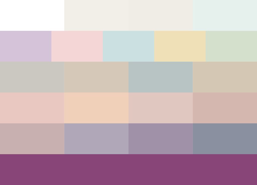
- White — #FFFFFF
- Translucent Pearl — #F2EFE9
- Pale Flax — #F0ECE6
- Mint Freshness — #E6F0EC
- Soft Lilac — #D5C4D9
- Rose Petal — #F5D6D6
- Watercolor Blue — #CBE0E0
- Soft Yellow — #F0E0B8
- Pale Pistachio — #D4E0CC
- Pearl Gray — #CAC8C0
- Warm Beige — #D5C8B8
- Gray-Blue — #B8C4C4
- Sand — #D4C8B4
- Rose Quartz — #E8C8C0
- Peach — #F0D0B8
- Powder — #E0C8C0
- Coral Tone — #D4B8B0
- Gray-Pink — #C8B0B0
- Gray-Purple — #B0A8B8
- Dark Lilac — #A090A8
- Gray-Blue — #8A90A0
- Twilight (unexpected color) — #874677